When someone viewing your blog using a mobile phone, he will be automatically redirected to the mobile version of your blog. If you see the web browser's address, you can see the "?m=1" part in your blog address.
http://YOURBLGNAME.blogspot.com/?m=1
In mobile version, blogger will be applied one of their basic mobile themes to your site. These themes are not looking nice. But if your custom blogger theme is mobile friendly, you do not want to use these blogger's basic mobile themes.
In this tutorial, I am going to explain how to display non-mobile (desktop) version, when someone browse your blog using a mobile phone. It will be useful if you are using a responsive blogger template.
Go to "Edit HTML" of your blog.
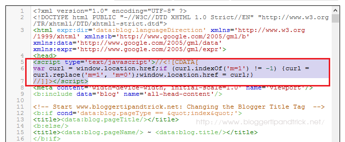
Add below code just after <head> tag of your blog:
<script type='text/javascript'>//<![CDATA[
var curl = window.location.href;if (curl.indexOf('m=1') != -1) {curl = curl.replace('m=1', 'm=0');window.location.href = curl;}
//]]></script>
After adding above code it will be look like this:

Save your template.
Now when someone visit to your blog using a mobile phone, "?m=0" will be added to the blog address instead of "?m=1".
http://YOURBLGNAME.blogspot.com/?m=0
Thanks it worked for me.
Thank you'